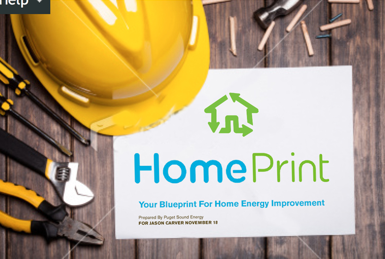
HomePrint
Brand Launch
How do you generate interest for homeowners and encourage participation in a state-of-the-art new home energy audit program than can help them maximize their home’s energy efficiency, and minimize their home's energy costs?
Working with the largest utility in the Northwest, Puget Sound Energy, we created and launched HomePrint.
Identity
The brand is designed to elicit feelings of security, confidence, and empowerment, working complementarily to its parent brand, Puget Sound Energy. Our name HomePrint is a “coined literal” conjoined word, designed to cue a strong literal association with the idea of a home’s “energy blue print”, with all the technical, data-driven correlations.
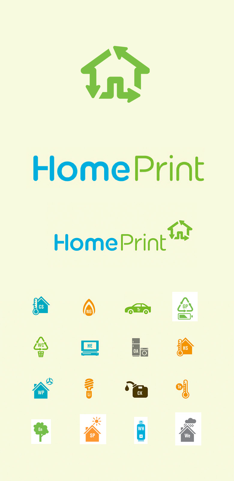
The HomePrint mark is designed to convey the ideas of energy flow, security, dynamism, and sustainability. Our custom typography counters an otherwise technical theme with a modern but personable approachability. The brand’s visual language extends outward from the simple infographical hero mark to introduce an entire vocabulary of infographics designed for ease of communication around complex elements of the audit.
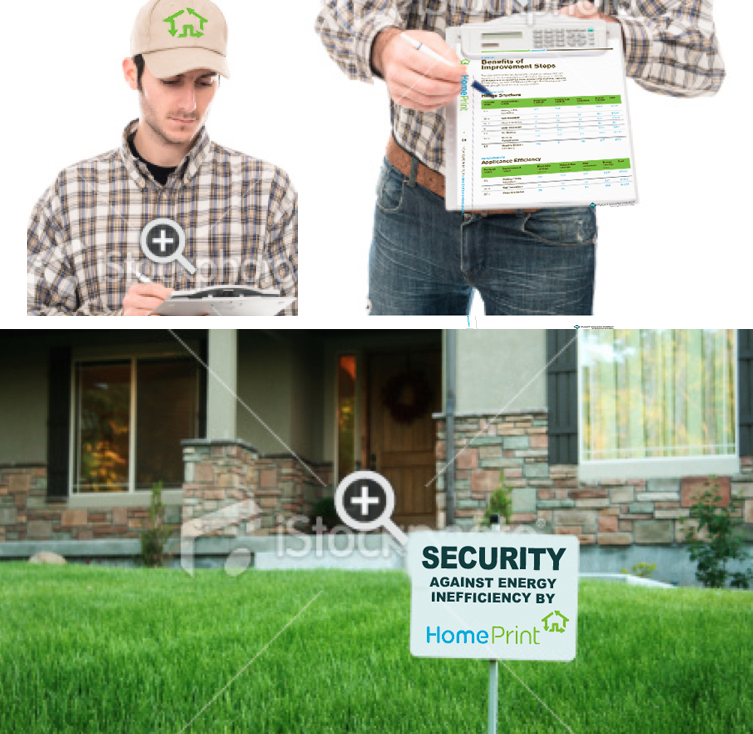
Collateral
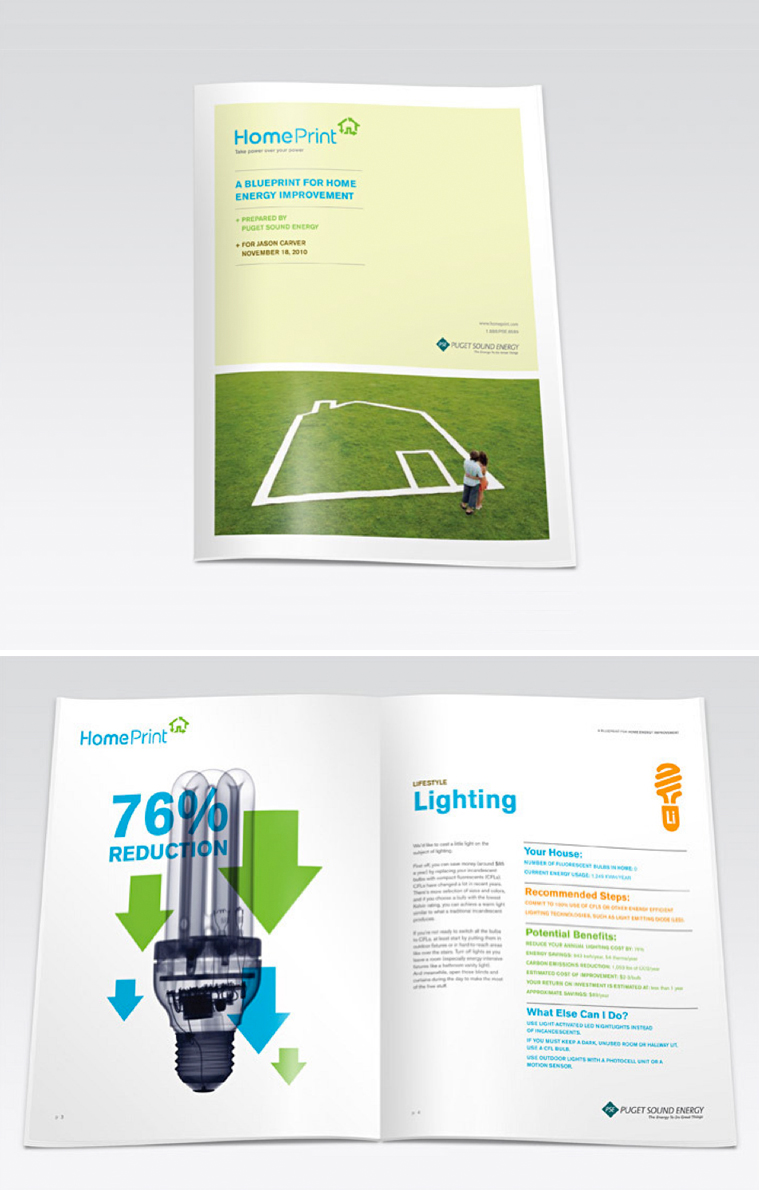
A range of materials, including the personalized audit report, extend the brand language with bold photography, a user-friendly grid, and interesting graphical interplay.
Mobile
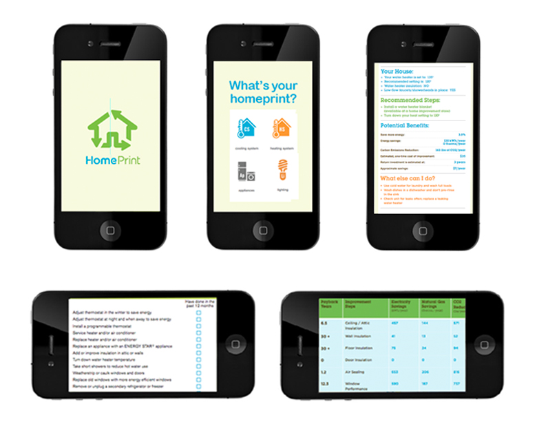
A simple app allows a homeowner to “pre-identify” their home’s energy sensibilities, with recommendations for improvement, setting the stage for ultimate conversion to a full audit.
Brand extensions
Team brand wear, promotional gear, and homeowner brand evangelist tools allow the brand to continue a life of its own.
Next project: Legalize It!
Previous project: Additional work